Create Free Column Charts
Jform’s column chart maker is a tool that helps you turn raw form responses into customizable column charts for clear data visualization. Use this column chart maker to select submission data, adjust colors and labels, and generate professional charts that update automatically as new data comes in. Chart results help you spot trends, compare values, and make data-driven decisions without coding.
템플릿
Explore Column Chart Templates
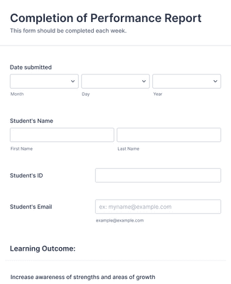
Student Perfomance Evaluation Form
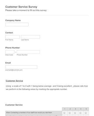
고객 만족도 설문조사 양식 템플릿
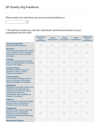
Quality Org Employee Feedback Form
혜택
Instantly Create Column Charts
Effortless data visualization
With Jform’s Report Builder, you can effortlessly convert your online form responses into engaging column charts. No complex coding or design skills required — simply select the submission data you want to see, and the Column Charts tool will automatically generate professional-looking charts that update with each new submission.
Build informative visuals
Translate complex data in a clear and concise manner by converting your form responses into column charts. Impress your audience with professional visuals that tell the full story of your form submissions and bring your data to life.
Spot trends and insights
With column charts, you can identify trends and gain valuable insights from your form responses in seconds. The visual representation lets you quickly spot patterns, compare values, and make data-driven decisions with ease to build a better business.
Easily customizable
Jform’s column chart maker allows you to customize your charts to fit your specific needs and branding in just minutes. Adjust colors, labels, and columns to create charts that align perfectly with your presentation or report style. The best part? No coding required!
Seamless integration with forms
By using Jform to gather data for column charts, you can both streamline your data collection process and automate chart creation. Your charts are automatically updated with each form submission, so they are always up-to-date.
사용후기
Jform에 대한 사용자의 의견
자주 묻는 질문
Jform에 대한 귀하의 모든 질문이 응답되었습니다. 일반적인 질문들에 대한 응답을 위해 자주 묻는 질문들을 확인하거나 더 많은 정보를 위해 저희의 고객 지원팀에 연락해 주십시오.
How do I create a custom column chart?
With Jform, creating a custom column chart has never been easier! Simply open Report Builder and click + New Report. You can select an existing form to pull data from, import data, or opt to use a sample report. Your data will then be converted into a report. Simply click on the gear icon next to any set of responses and select Column under Chart type. Your data will then populate as a handy column chart, and you can customize it to your liking from there! When you’re done, your report is ready to download, print, or share in seconds.
Is Jform’s column chart maker free?
Yes, Jform’s column chart maker is completely free to use and always will be.
However, Jform’s free Starter plan only allows for 100 monthly form submissions. You can access higher submission limits with a paid Bronze, Silver, or Gold plan.
Can I spot trends and patterns in my data using the column charts?
Yes. In fact, this is one of the main perks of using a column chart to visualize your data! Column charts allow you to create side-by-side visual comparisons of form responses to quickly contrast their values. This makes it easy to identify high-level patterns and trends within your data.
Column charts are also a great option for presenting your data to an audience because they let you demonstrate these trends with ease.
What are column charts used for?
Column charts are used to display and compare the values of multiple categories or groups of data. They are particularly handy for illustrating trends, patterns, and relationships between multiple categories of data, and they’re perfect for data presentation and interpretation, categorical analysis, and much more!