Jform 리포트 빌더
신속하게 귀하의 데이터를 시각화하고 발표하세요.
Jform 리포트 빌더로 데이터의 잠재력을 극대화하세요. 제출물을 분석하고 결과를 공유하며 회사를 성공으로 이끄세요.
지금 사용하세요 - 무료입니다!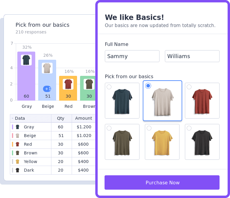
양식 반응들을 전문적인 리포트들로 바꾸세요
양식을 사용하여 피드백, 설문조사 응답, 설문조사 응답 및 중요한 고객 데이터를 수집한 다음, 해당 데이터를 새로운 제출이 있을 때마다 자동으로 업데이트되는 전문적인 보고서 및 프레젠테이션으로 변환하세요.
3가지의 쉬운 단계들로 양식 데이터를 수집하거나 시각화하고 발표하십시오
-
1
저희의 양식 빌더로 온라인 양식이나 설문조사를 만들고 게시하세요.
-
2
실시간의 양식 데이터를 맞춤설정 리포트들 또는 귀하의 브랜딩에 어울리는 발표 자료들로 전환하세요.
-
3
링크를 통해 리포트들을 공유하거나 귀하의 웹사이트에 그것들을 임베드하고 안전한 PDF들로 다운로드 하십시오.

귀하의 브랜드가 돋보이도록 리포트를 맞춤설정하세요
브랜드는 귀하의 비지니스를 대표합니다 — 그러므로 리포트가 브랜드를 잘 나타내게 하세요.
-
Jform 리포트 빌더로 단 몇번의 클릭에 레이아웃을 개별화하세요.
-
로고와 색상들을 맞춤화하는 것으로 귀하의 브랜드를 나타내세요.
-
고유한 차트 옵션, 아이콘 및 모양들로 강력한 시각 자료들을 만드세요.
깊은 통찰력을 위해 데이터를 쉽게 분석하십시오
강력하고 새로운 통찰력을 보일 수 있도록 데이터와 시간 필터링으로 귀하의 제출자료를 정리하세요. 귀하의 비지니스를 향상시키기 위해 결과물들을 분석하십시오.
기능 보기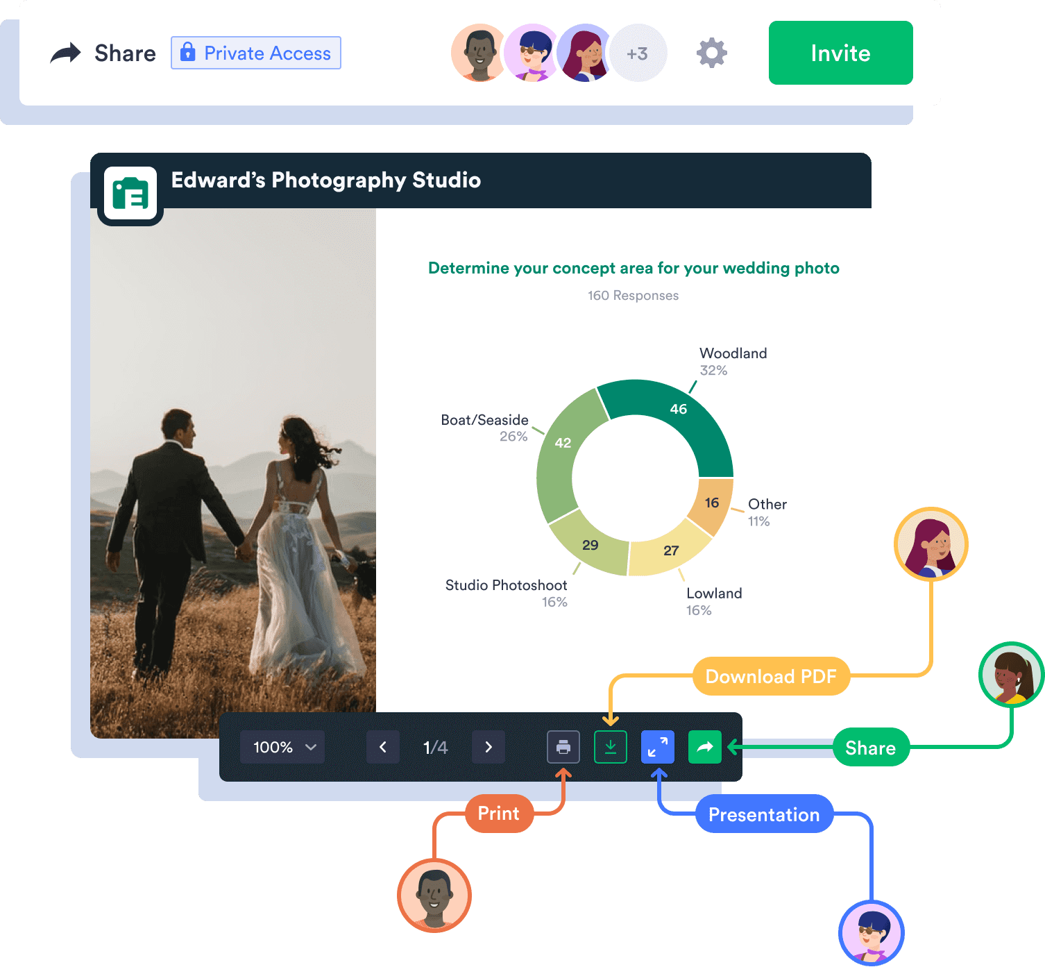
전 세계와 귀하의 발표물을 공유하세요
귀하의 리포트들을 프리젠테이션으로 바꾸고 자신의 팀원들과 그것들을 공유하세요.
직장 동료와 고객들과 공유하세요
귀하의 실시간 리포트들에 대한 접근을 얻기 위해 이메일 초대장 또는 리포트의 고유 링크를 전송하십시오.
PDF 리포트 생성
단 한 번의 클릭으로 보고서를 PDF로 변환하세요. 모든 장치에 다운로드하거나 직접 회의를 위해 인쇄하세요.
프라이버시 설정 관리
비밀 정보를 안전하게 유지하기 위해 귀하의 리포트들에 대한 접근을 제한하세요.
기능 보기더 많은 정보가 수집되면서 업데이트되는 맞춤설정 리포트들을 만들고 공유하는 능력은 게임 체인저 입니다.

설정하는데 많은 시간이 걸리는 내보내기(export), 피벗 테이블, 그래픽 및 마크로는 더 이상 없습니다.